Manchester has lived in my imagination since hearing Blue Monday in 1983. Having obsessed over this city’s music and design for so long, it was exciting to finally visit for Design Manchester 19.
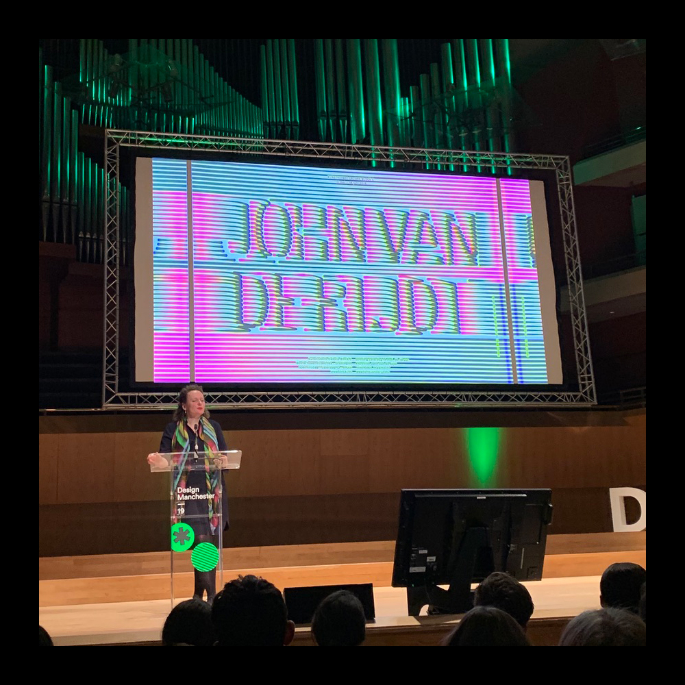
The one day conference featured a packed programme, with stand-out talks from Extinction Rebellion and Paula Scher but my highlight was Hansje Van Halem. Her spell-binding typography is the product of constant experimentation and play and appears both decorative and modernist. And creating such repetitive but inventive pattern must demand patience too.

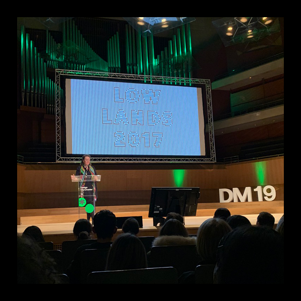
Many of the day’s speakers recommended the importance of side projects to inspire professional practice. Hansje is of the same mind and shared a delightful example of creating new letterforms by doodling the name of her new boyfriend. Hansje’s new love inspired the visual identity for the Lowlands Festival in the Netherlands. He must be exciting company, as the typography is colourfully giddy and rarely stays still. Just take a look at the website.